

Substack Has Just Given Us One More Way to Stand Out
An opportunity to be yourself...because everyone else is already taken.

This just in!
You may or may not have already noticed that Substack has made a few tweaks in the past few days. For instance, the new dashboard. Have you tried it yet? What do you think?
However, that’s not what I’m writing about today…
They have also introduced a new addition to your branding kit. They’re calling it a cover image, and it allows Substackers to spice up our personal profiles…totally separate from our publications.
Here’s mine:
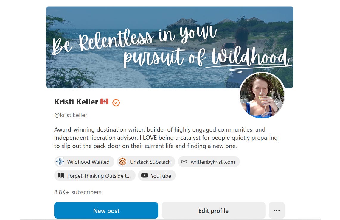
Note that this image is on my profile, not any of my publications.
Why is this awesome? Because you, as a writer, are not just the sum of your publications. You’re YOU….and now you have the opportunity to emphasize that by making a splash on your profile page.
If mine looks familiar, it’s because I’m using the same image for my profile as I’ve got on my welcome page for Wildhood Wanted, but it doesn’t have to be the same. You can now customize an image you’d like people to see when they visit your profile page.
To design your own in Canva, I’ve found that the optimal sizing is 1200x400 px, or any variation of that ratio. I actually used 1800x600, and it fits just the same.